Back to Case Studies
Ecommerce UX Case Study
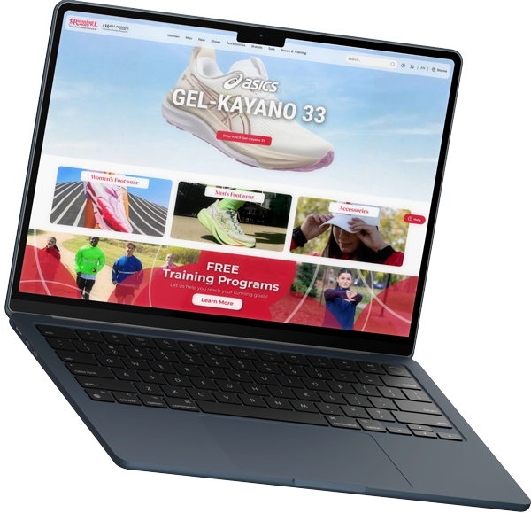
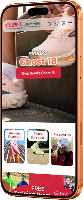
Running Room
Running Room
Ecommerce Redesign
Modernizing a legacy ecommerce experience with a mobile-first UX strategy focused on product discovery, usability, and conversion optimization.
Role
Senior UI Developer & UX Lead
Timeline
Sep 2023 – Present
Scope
Full Storefront Redesign
Focus
UX + Conversion Strategy